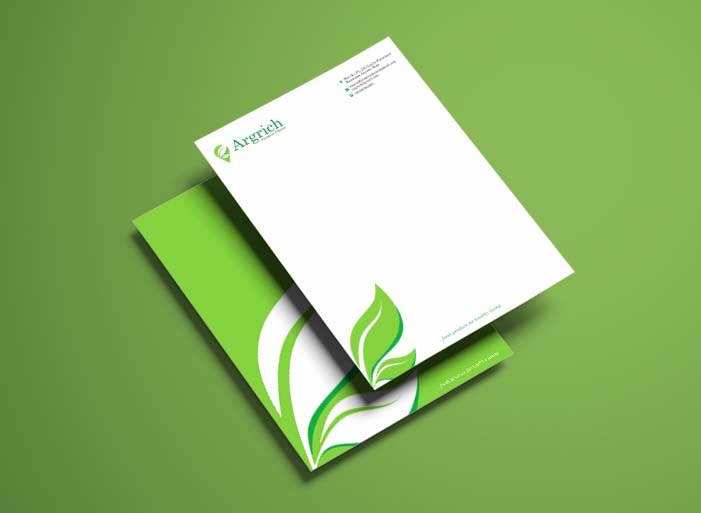
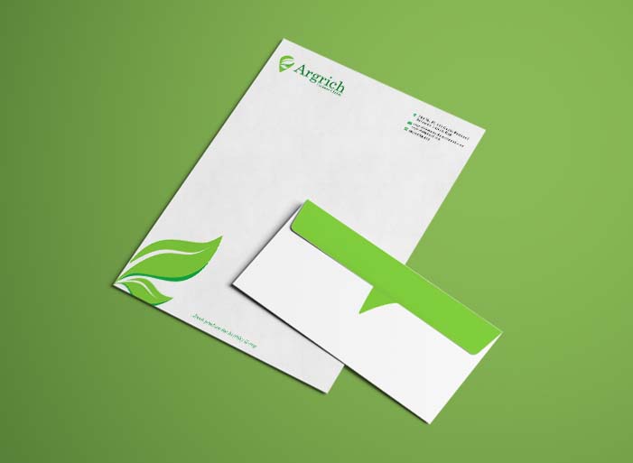
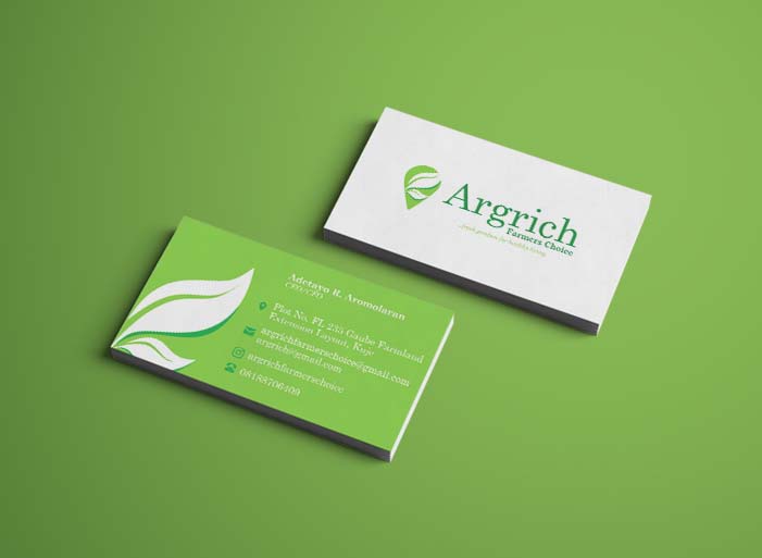
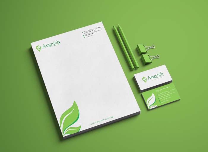
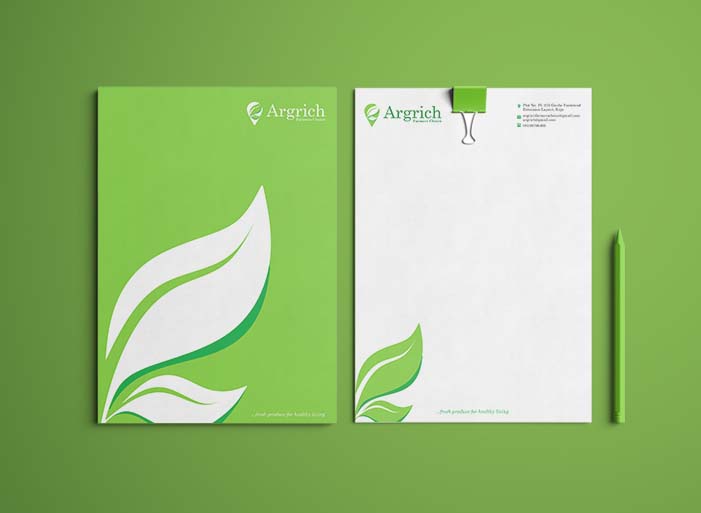
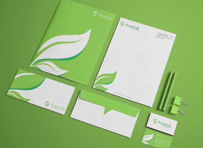
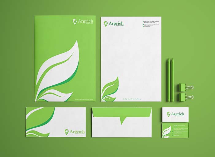
Argrich
Argrich Farmer's Choice is an advancing agricultural company that is specialized in the distribution of quality fresh produce and delivers them to your doorstep based on your preferences.
Argrich
Argrich
Argrich
Argrich
Argrich
Argrich
Argrich
Project Summary
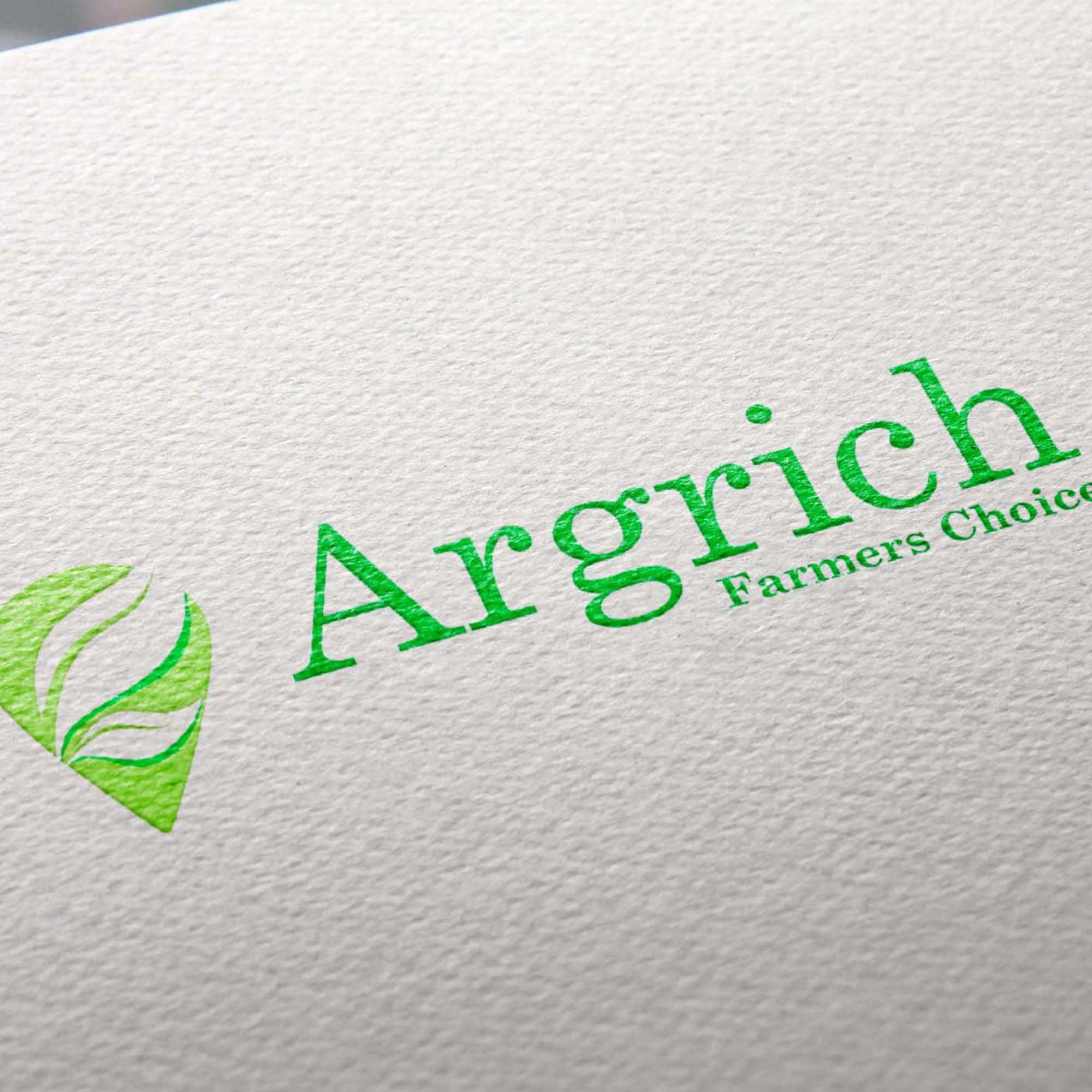
The logo in its basic form is a location icon and fresh, healthy leaves. The location icon represents the brand delivering fresh foods to the client’s doorstep. The leaves on its own symbolizes the nature of the brand’s product ‘ágricultural produce’. Also, it symbolizes the hygienes and organic measures in handling the produce.
The bright, dark, and rich green colors symbolize the soil, the home of all plants, also, to evince the natural non-preservative state of the produce.
The serif typeface is an intentional decision to depict non-prejudice and impartiality of the brand, implying that the brand farms for all.
After filling the questionnaire we gave our client, we used it to help create what the customer had in mind. We also made sure it was relatable to anyone. Our client was pleased with the logo we made for them and commented on how simple yet easy to understand the symbols were.
Our Approach
Design Brief & Research
Brainstorming & Sketching
Execution & Presentation