Design Fails – 5 Practical Guides To Designing Good Flyers.

By now, you must have heard that design is the secret to great business. This is so true, your overall design would determine how customers relate and respond to your product, service or advert.
Flyers are basically blank papers waiting to get spiced up in order to convey a message. The message could be anything – business promos, advertisements, announcements – taking up any shape or size.
In some cases, flyers stand as “first impression” and people generally judge the event or product based on what the flyer looks like. Both good and bad designs easily get noticed but the former gets quick attention as well as results while the latter gets ignored at first glance. I’ve come across a lot of flyers and the only reason I stare at them is because they are actually hilarious and i just wonder why we all allow bad designers run free.
If you want to draw the right audience with flyers, these are 5 simple guides you’d want to apply on your flyers:

UTILIZE PROFESSIONAL, EYE-CATCHING PHOTOGRAPHY
You must have noticed over time, companies that produce kiddies stuff use a lot of animations, cartoon-like images, playful font, and colors. Kids get attracted to all these and they want mommy to get them a piece of that product because the design is really appealing to them. That’s exactly how it is with every other person. What you’re advertising on your flyer could be the hottest event of the century but you wouldn’t get enough audience because the images, fonts, and design totally suck. At first glance, something must catch their gaze, whether it’s the cool image, colors or typography, it must be eye-catching and trendy. Before viewers get to see the message, the flyer must first be attractive and scream “Read Me!”
KEEP YOUR DESIGN SIMPLE
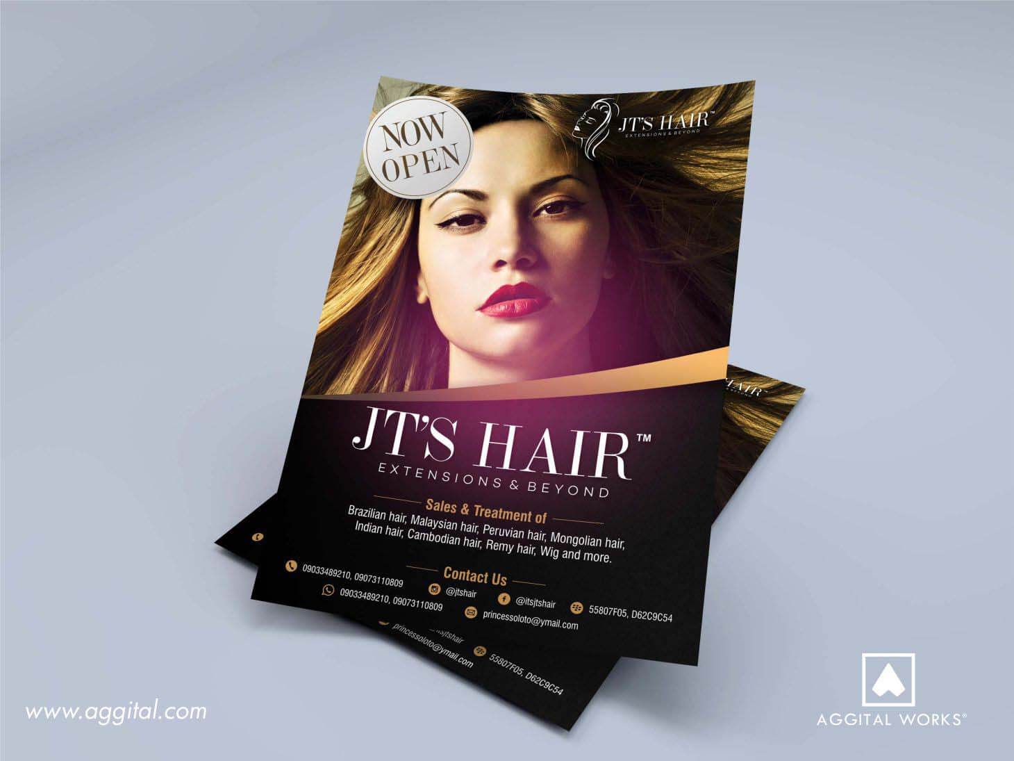
Simplicity Equals Sophistication. We totally get it, it has to have all the information and look really good, so you crowd your flyer and make it look like a trade fair. What you want to do is make it as simple as possible. Using few colors and not so complicated typography wouldn’t hurt. Also, the images shouldn’t be hanging on every little corner of your flyer, it throws the whole purpose off balance. There are flyer design with just color Black and Gold, they depict royalty and will draw attention anyday. On top of this, white space is life! You don’t have to swallow all the space, it’s nice to give room for fresh air plus it makes your message more visible.
ORGANIZE YOUR CONTENT
What’s more important and what message are you trying to convey? I’m guessing the main reason for making the flyer is to create awareness for something, maybe a Fund Raising Club or a new Band Concert that’s coming to town. Whatever it is, put that on top of your list and make it as visible as a black paint on a white dress. To make this easier, before you start placing anything on your flyer, you need a content strategy. What would you include if you have more than needful free space? You should have some sizzling copywriting ideas penned down too. Style font size, proximity, alignment are what you should really pay attention to. As you consider all of these, make sure it’s not so much, you wouldn’t want to overwhelm your viewers.

USE INTERACTIVE VISUALS
You’re advertising a new studio for Painters or a Writers Club, it would be nice to use something that relates to Writers and Painters. A noting pad or a blank canvas would suffice. Your images should relate to those you’re trying to attract, it makes them feel already connected to whatever you’re showcasing.
ADOPT COLORS
Nothing does magic in design like great colors, and if the colors are too clumsy, it wouldn’t look good enough too. Colors connect to our feelings and emotions on so many levels, that’s why it’s important to adopt the right blend on your flyer design. We have something regarding color psychology and what feeling each color arouses in us. You should take a look and use a color that’s in tune with your message.
ARE YOU FIRED UP?
Maybe you didn’t know all of these and now that you do, it’s best you implement them. You may have a known brand already and your flyer design must be in line with it, pick the right colors and use the best images.
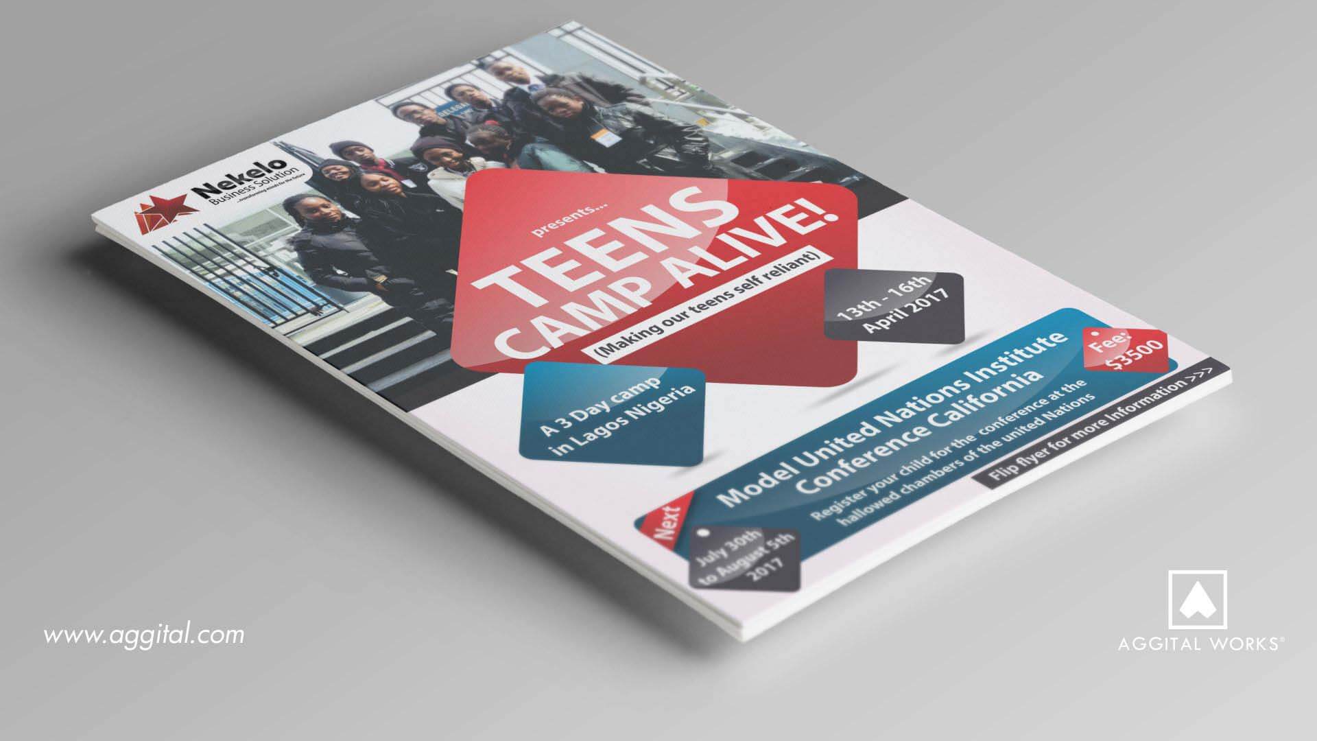
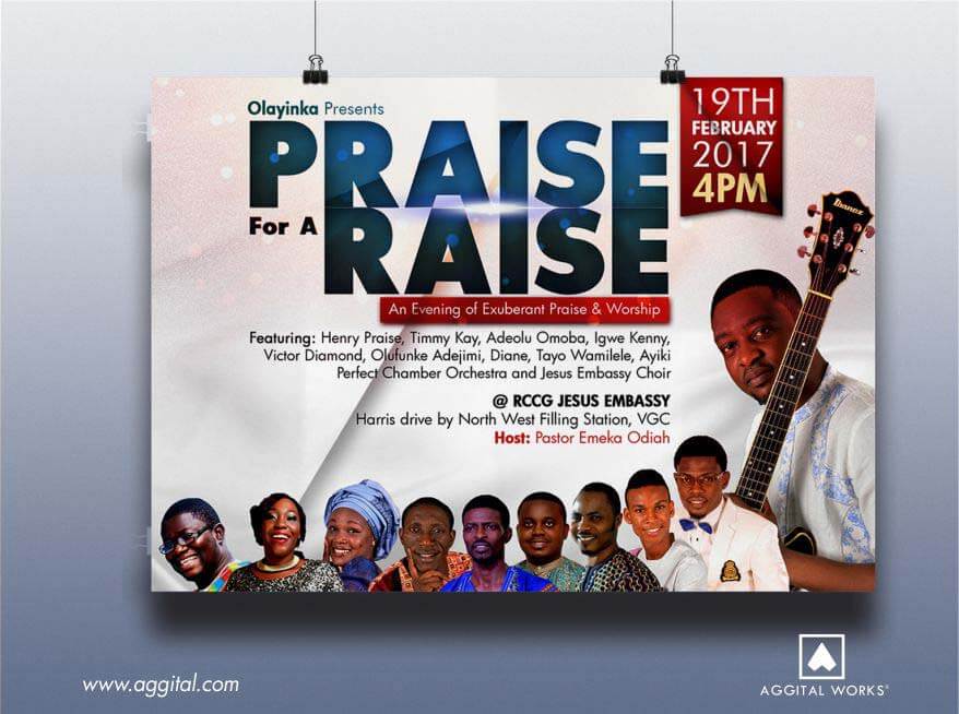
Also, we make really cool fliers and the images above are great examples. Contact us right now to start your project.


