Holla Courier – Logo Design
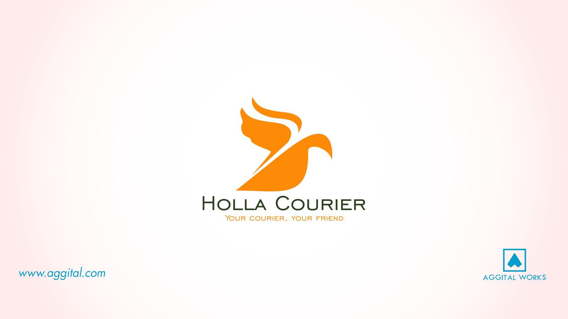
In recent times, we have designed a whole lot of logos for various businesses and it’s being a wonderful experience. Ranging from the simple logos that had no issues at all and the ones that literally took our breaths away, they all turned out really good. Well, Holla Courier logo actually belongs to the category of the former.
The business is located in the United States of America and what they do is quite simple: they help deliver goods within Nigeria and America. It’s a community of individuals who help transfer goods from one location to another.
Here’s how it works, they carry out a constant update on their present location and if anyone is leaving for the United States or for Nigeria at the time, you have to deliver a package. The whole idea simply makes transfer of deliverables really easy, you don’t have to travel or go through any courier service. Holla Courier is flexible and you have direct contact with whoever you’re receiving from or delivering to. The service is really affordable as well.
It’s simply third-party logistics plus the service is really affordable too.
I’m sure you’ve heard about how we only get one chance to make a first good impression and it’s being proven to be true over and over again. In most cases, we miss this opportunity. As regards building an authentic brand, a logo is one aspect you can’t sideline.
Logo’s are very important and if you want to leave a great feeling on the mind of anyone, your logo must speak even in your absence. In our opinion, without a strong logo, you may never get the chance to prove your quality to your consumers. Hence, they may choose a competitor instead.
Holla Courier had a logo, which wasn’t so “cool”. It was a picture of a bird that had an envelope in its mouth. The logo appeared more like a clip art that was scratched off Google and on top of this, it wasn’t duplicable.
In addition, the logo couldn’t adapt to different environments. Of course, once a brand looks tired, the consumers get a negative vibe.
So, one of our existing clients referred us to the executive officer of Holla Courier and we had a quite lengthy discussion. They wanted a whole lot. The logo wasn’t working for them and they basically needed a revamp. Consequently, we received a project brief which helped us understand what they wanted the Holla Courier logo to convey.
We believe in the power of teamwork and our brainstorming session never misses the mark. Although, it took a while, but creating the logo wasn’t so hard; it took two days actually.
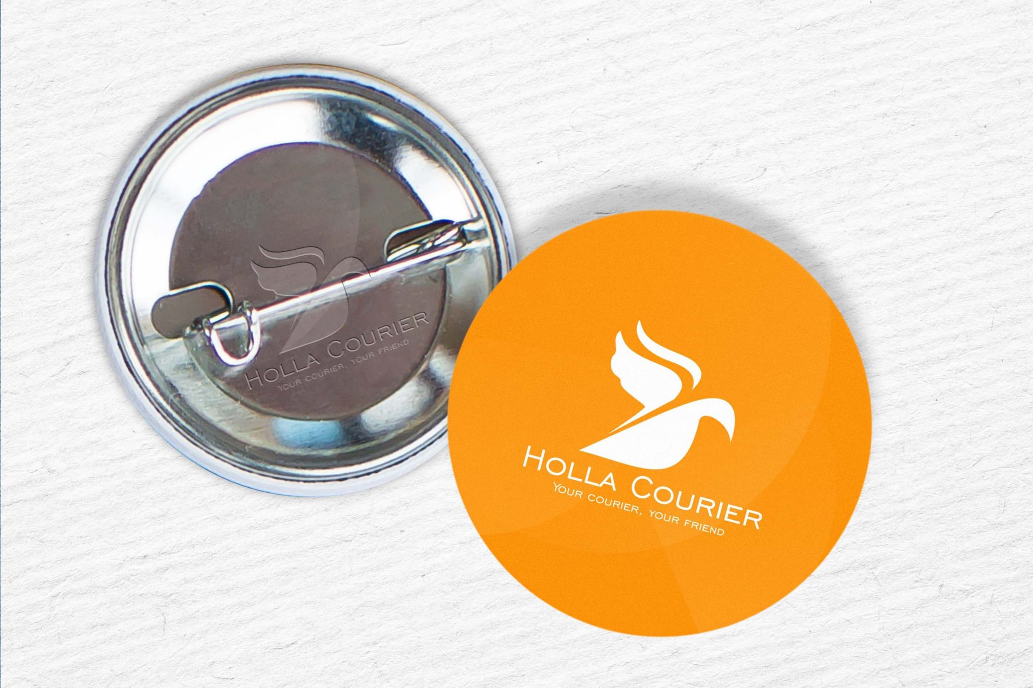
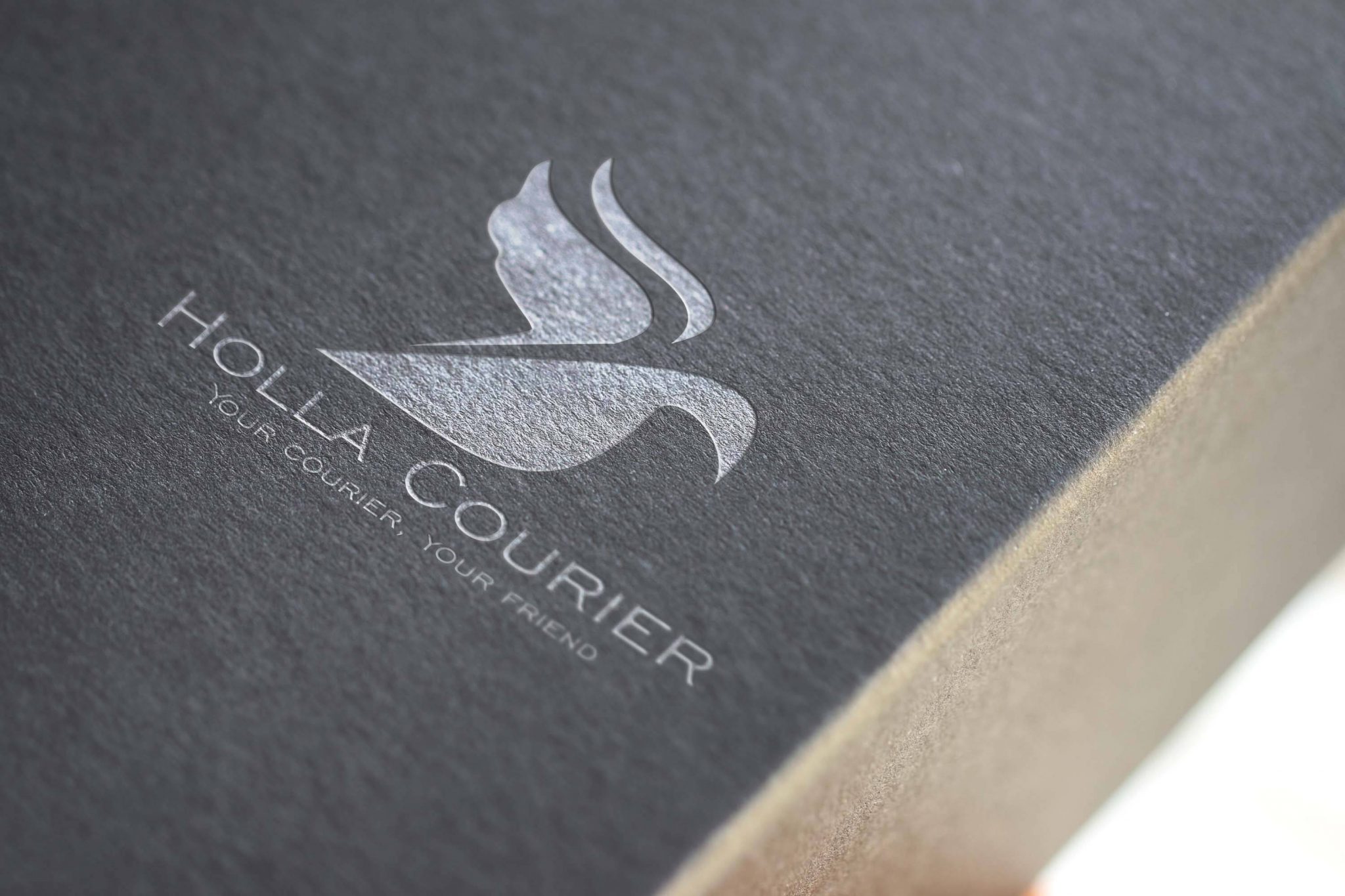
As you can see, we crafted a bird too, but this time, without an envelope in its mouth. You should note that the “bird” logo is completely different from the former logo, it perfectly depicts what the business stands for.
Finally, the Holla Courier logo design is iconic, scalable, memorable, timeless and adaptable.
You could follow the link above to read about how branding can help your business and also fill our logo questionnaire if you need a revamp too. We are ready to serve you anytime!


